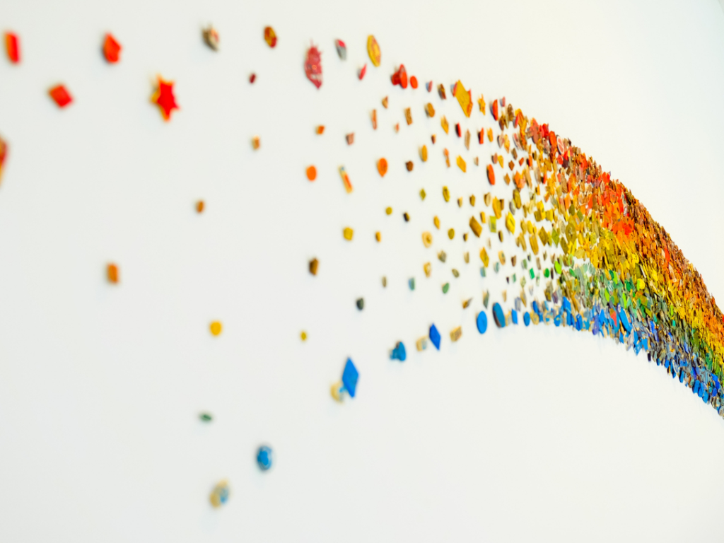
We’re doing some visual identity work at the moment and just had a long conversation about colour. It started with a ‘I really don’t mind what we do’ and ended with ‘anything but purple’ and ‘oh, I really hate green too!’ Colour produces such an automatic and emotional response, it’s no surprise that we think it’s a big deal.
Brands have always used colour to influence purchase decisions and change perceptions. As well as being a brand shorthand for consumers colour communicates at a more subliminal level. Colour conveys emotion faster than words (it certainly did in our meeting and the relationship between colour and brand identity must be carefully put together but used well it can be a critical component in any branding toolkit.
The rebrand of NatWest is a good example of this. They wanted to position themselves as different to their competitors who typically use red and blue, think Barclays, RBS, Santander and HSBC, so went for a strong purple with the ambition to signal a range of attributes including integrity and ambition..
Hotel group IHG uses colour to drive awareness and positive brand sentiment. The Holiday Inn brand, for example, uses colour to tell both an old and new story. At the core of the colour palette is green, a colour that has featured in the logo from day one. Green communicates the values that mean the most to the brand: nature, safety, freshness and liveliness. A secondary palette, comprised of lively yellows, light pink, red and sky blue, signifies the core brand promise around joy and happiness.
In an article in Marketing Week, Sangeetha Ramkumar, director, guest experience and design at IHG says, “Holiday Inn is a joyful, happy and optimistic brand that delivers personality in a world of franchise hotels. We believe the colour palette helps us stand out and makes the brand more approachable.”
When asked about the importance of choosing the right colours in the article, Laurie Pressman, vice-president of Pantone Color Institute at Pantone, said that colour has the ability to broadcast instantly the message and meaning of a brand. She says, “When I look at colour today it has become symbiotic with design and you have to get every element right,” and, when it is right it works; it just clicks. And that is the engagement process. When one piece of it is off, you take the chance of people walking right past you.”
“You have one chance to make a first impression and colour plays such a big role in that,” warns Pantone’s Pressman. “People are coming to understand that more and more – I used to say you have three seconds to get someone’s attention. Now I think it is two. You don’t want someone to pass you by.”
A brand may be recognised by name, logo or product type but the first thing to catch a consumer’s eye is often its colour. Let’s make sure we make the right choices!

